
It’s been five months now since we first shared some information about what it is believed to be a new Kings jersey for the 2024-25 NHL season.
For those playing catch up, several sources have told Mayor’s Manor to expect a rebrand in the months ahead. Mentioned in our original article was a desire to move back toward the early ’90s Kings look. Next year will bring changes league wide, as the NHL switches over to Fanatics as the official jersey supplier — with the Adidas contract officially ending very soon. However, generally speaking, there has been talk of a scaled back approach. Teams are expected to have just two jerseys, a home and road sweater, with third jerseys returning in 2025-26, as Fanatics ramps up production capabilities.
From what we’ve learned over the past few months, the new Fanatics jerseys appear to be completely redesigned from the ground up and should not have the same concerns Major League Baseball incurred during their change over this past winter.
If you missed our updated article in March, we shared a video from Icethetics that went into some production details surrounding the new NHL jerseys, as well as a mock up of next year’s potential practice jersey:

Similar to what we’ve done previously surrounding other jersey debuts, we’ve asked our artists to mock up several different versions based upon information received from various sources.
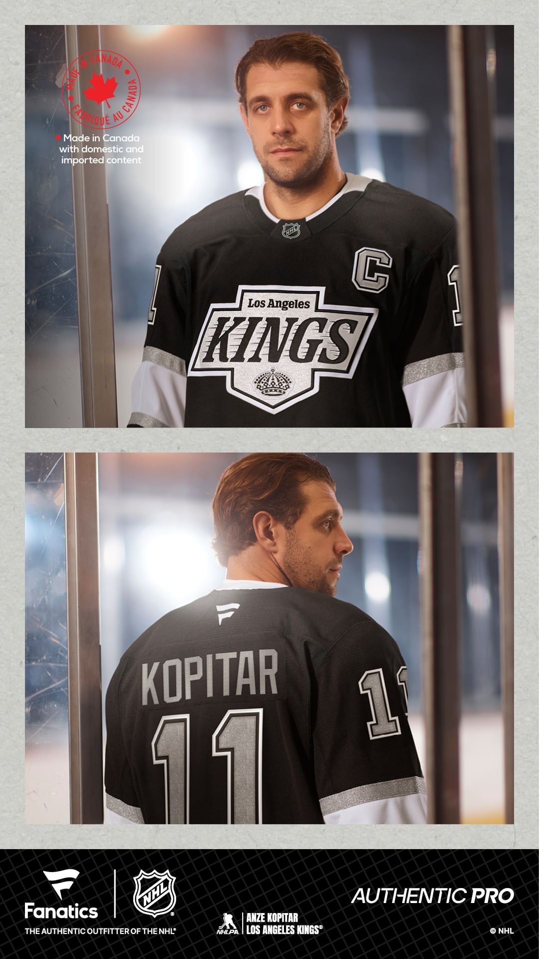
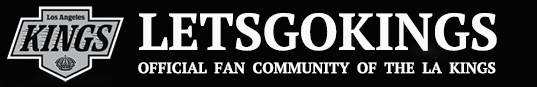
In the spirit of transparency, we still believe when the new Kings jersey is officially revealed it will look more similar to the first comp we debuted back in December:

However, we wanted to pull together a few other comps for some alternative views. As such, we tapped ALoImages for another jersey mockup. This latest one riffs off of some crest designs we first explored back when the Reverse Retro project was in its infancy stages.


According to SportsLogos.net, from 1975-87 the Kings had a purple and gold version of this crest as part of their official logo package, even though it was never worn on their jerseys. A silver version — similar to what’s used below — was added in 1987. Again, though, that was never used on a jersey. It was slightly modified into what officially debuted in 1988 and was worn throughout most of the ‘Gretzky Era.’ Is that what the Kings are going to with their upcoming rebrand? Most likely.
If they wanted to do something different instead, they could resurrect that 1987 look, as depicted on the jersey below.

Perhaps this would be a fresh look that ties together several eras of the franchise.
NOTE: the new Kings jersey will most likely share the same crest across both the home and road jersey. That’s standard practice. We used two slightly different crests above just for illustrative purposes.
Also worth mentioning is the Kings agreement with Mercury Insurance for a jersey patch is still in place for next season. As we reported last summer, that’s a multi-year agreement for the black home jersey. As of this writing, the Kings do not have a sponsor for a patch on their white jerseys just yet. That could change heading into next season.
Last we checked, the helmet sponsors with American Express and Blue Shield are also expected to be in place for next season, as well.
If we’re able to get more information on what the actual jersey may look like, we’ll be sure to pass it along.
Until then, we’ll close out with one other nugget. From what we’ve heard, the Reign will not be changing their primary crest next season. They’ll continue to use a ‘blacked out version’ of the ’90s era crest.
RELATED CONTENT:
Follow @mayorNHL
Continue reading...