
You are using an out of date browser. It may not display this or other websites correctly.
You should upgrade or use an alternative browser.
You should upgrade or use an alternative browser.
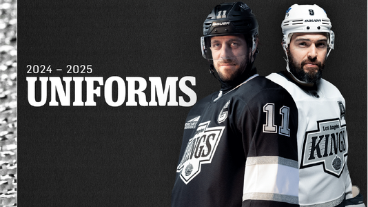
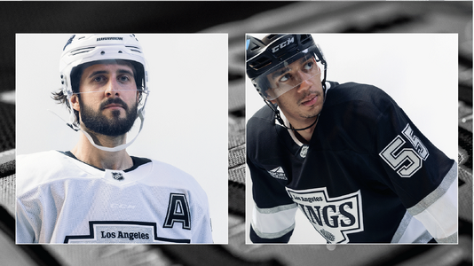
New Kings jerseys
- Thread starter Rinkrat
- Start date
LAKingSteve
Super Star
The home authentic is out of my price range, wonder how much customization will be on top of the $190. May be cheaper to buy a blank and have my guy do the customization.
mugs
TEAM LGK
Who do you use for customization?The home authentic is out of my price range, wonder how much customization will be on top of the $190. May be cheaper to buy a blank and have my guy do the customization.
EB924
Top Forward
Bleh. If you're gonna stick with the boring black and white just use the original jersey and logo and be done with it. I'd prefer pruple and gold but if they insist on 90's nostalgia stick with what worked.
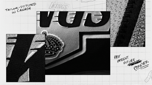
I'm not sure if it's that the bottom stripe is bigger than it used to be, or it's just the fact that it's higher up on the jersey, or a combination of the two, but it's taking up way too much real estate. Add the more squat chevy logo and it makes the players look...fat, for lack of a better word. Don't like the lower arm strip with the # closer to the shoulder.
I'm not sure if it's that the bottom stripe is bigger than it used to be, or it's just the fact that it's higher up on the jersey, or a combination of the two, but it's taking up way too much real estate. Add the more squat chevy logo and it makes the players look...fat, for lack of a better word. Don't like the lower arm strip with the # closer to the shoulder.
LAKingSteve
Super Star
This guy, Martin Jeffries. Lives in Texas right now, moving back to So Cal this summer. Log into FacebookWho do you use for customization?
These are the most recent jerseys he did for me, he's done several.
Attachments
santiclaws
I was in the pool!!
The top of the line one is made by the same company as was making jerseys for NHL teams before, just with a Fanatics logo instead of Adidas, and it's the first time in 10 years the real authentic on ice jersey will be available to buy. As for the rest...So silly that the Kings are acting like it's some big reveal and that we would all "really" like it. It's EXACTLY what is expected to look like.
Plus it's made by Fanatics no? Hard pass.
Just take your old CCM jersey out of the closet and start wearing it again.
It looks better too.
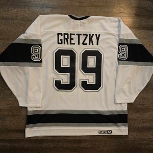
Yeah....that thing don't fit no more

LAKingSteve
Super Star
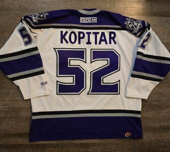
Yeah, mine is now autographed by Luke and framed on a wall. That being said, I did buy some larger blanks over the past couple of years and have had home and away Gretzky and Robitaille jerseys made.Yeah....that thing don't fit no more
JayWells24
Top Forward
Not a fan of them. I would have preferred them to bring back the purple and gold or even the Forum blue and gold. Us old fans prefer nostalgic. At least this one does.
DryKing
Power Forward
I want to like them but I'm not a fan. To me, the emblem appears to be too large, not a fan of the numbers on the shoulder instead of on the sleeves, striping looks off and the emblem looks like someone got carried away with bold fonts (as others have mention, the shape also looks off). Should have just gone back to the Gretzky era jerseys instead of this new watered down copy cat version.
I'm sure these will look good during games when watching from home or the stands though.
Purple and gold would have been great too.
I'm sure these will look good during games when watching from home or the stands though.
Purple and gold would have been great too.